-
40EMAIS
■■■
The 40eMais aims to provide experiences and knowledge for the audience aged 40 and above. We want to bring content about entrepreneurship, health, fashion, job market, socialization, digital tools, entertainment, and tourism to this segment. We aim to form a network of people who will have access to information tailored to their interests and occupations.
The 40eMais proposes to be the hub of online content, with the portal, and in-person, through events and activities they are creating around this theme. It's a unique and innovative project, and IAP is proud to be part of it, including being an advertiser on the portal.
___________________________
Client ■■■
40EMAIS
Service ■■■
Total Brand Project
- Brand Identity
- Website
- Layout
B RAND
For such an innovative project, breaking away from the ordinary is a must!
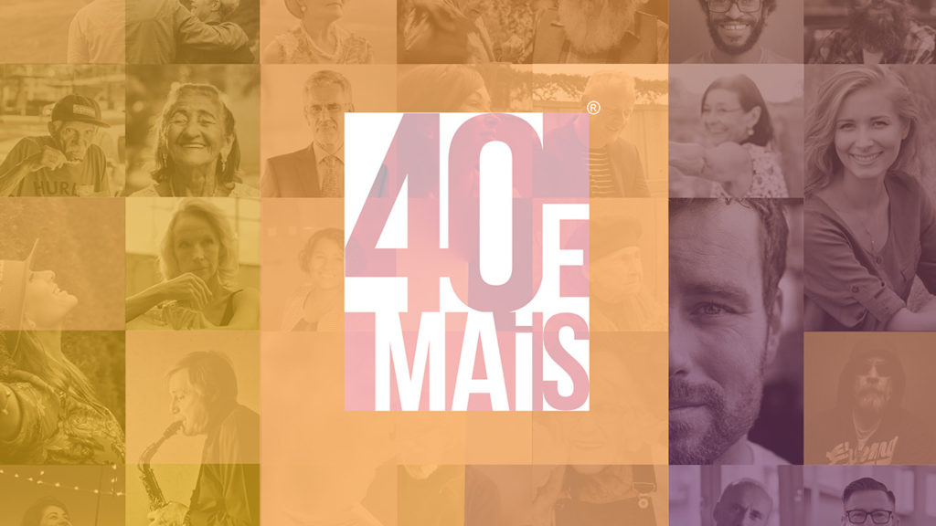
We tested dozens of ideas to create the logo for 40 and More, from a fan that would rise up to a clock. But the proposal had to be as original as the project itself. So, the idea of creating something timeless, that wouldn't age over time and would be enduring, just like the project's target audience. Moreover, we absolutely didn't want to fall into clichés. Thus, we created an icon with a strong font and eye-catching colors, which can be adapted to many different applications.


#5e276e
#ffc40d
#1e002b
#9e9e9e
BEBAS NEUE
A B C D E F G H I J K L M N O P Q R S T U V X Y Z
a b c d e f g h i j k l m n o p q r s t u v x y z
0 1 2 3 4 5 6 7 8 9
W EB
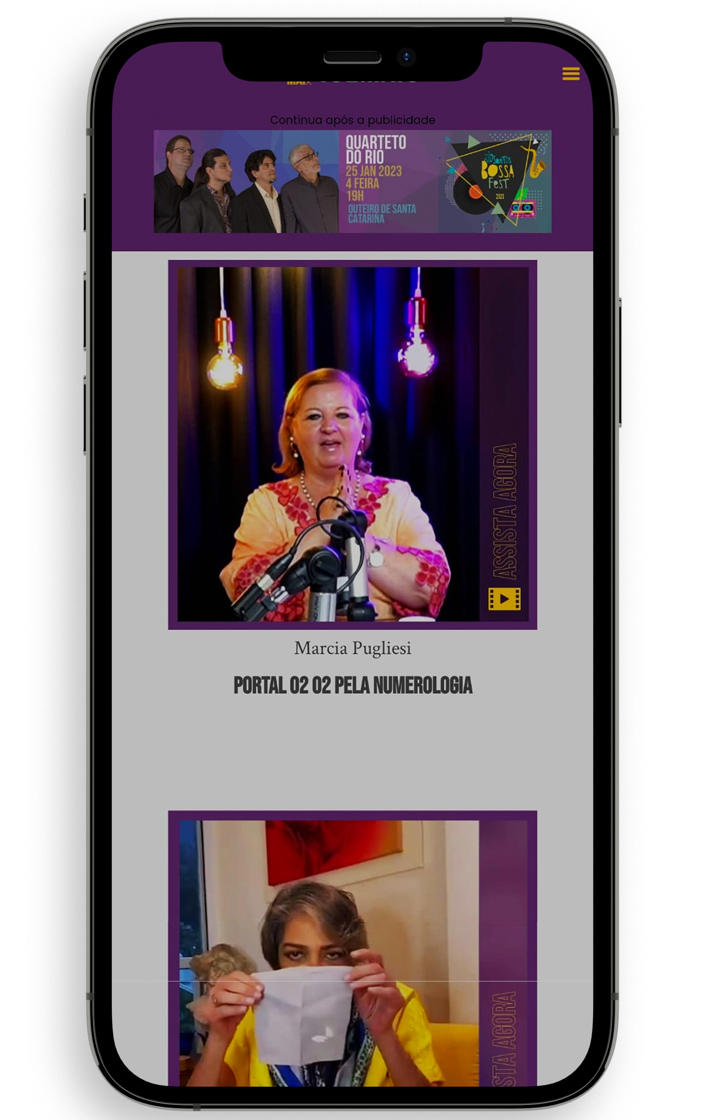
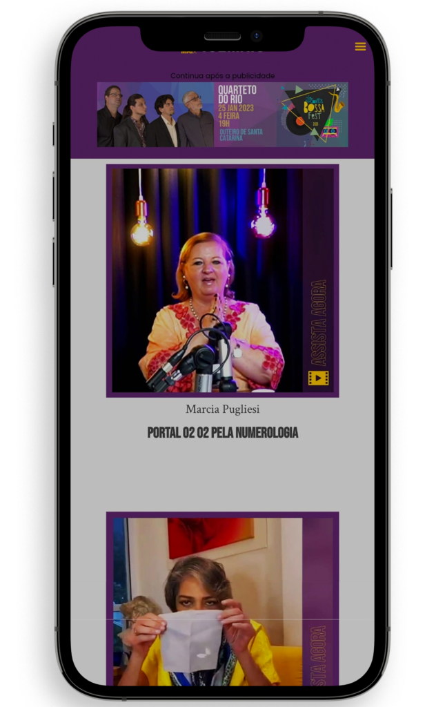
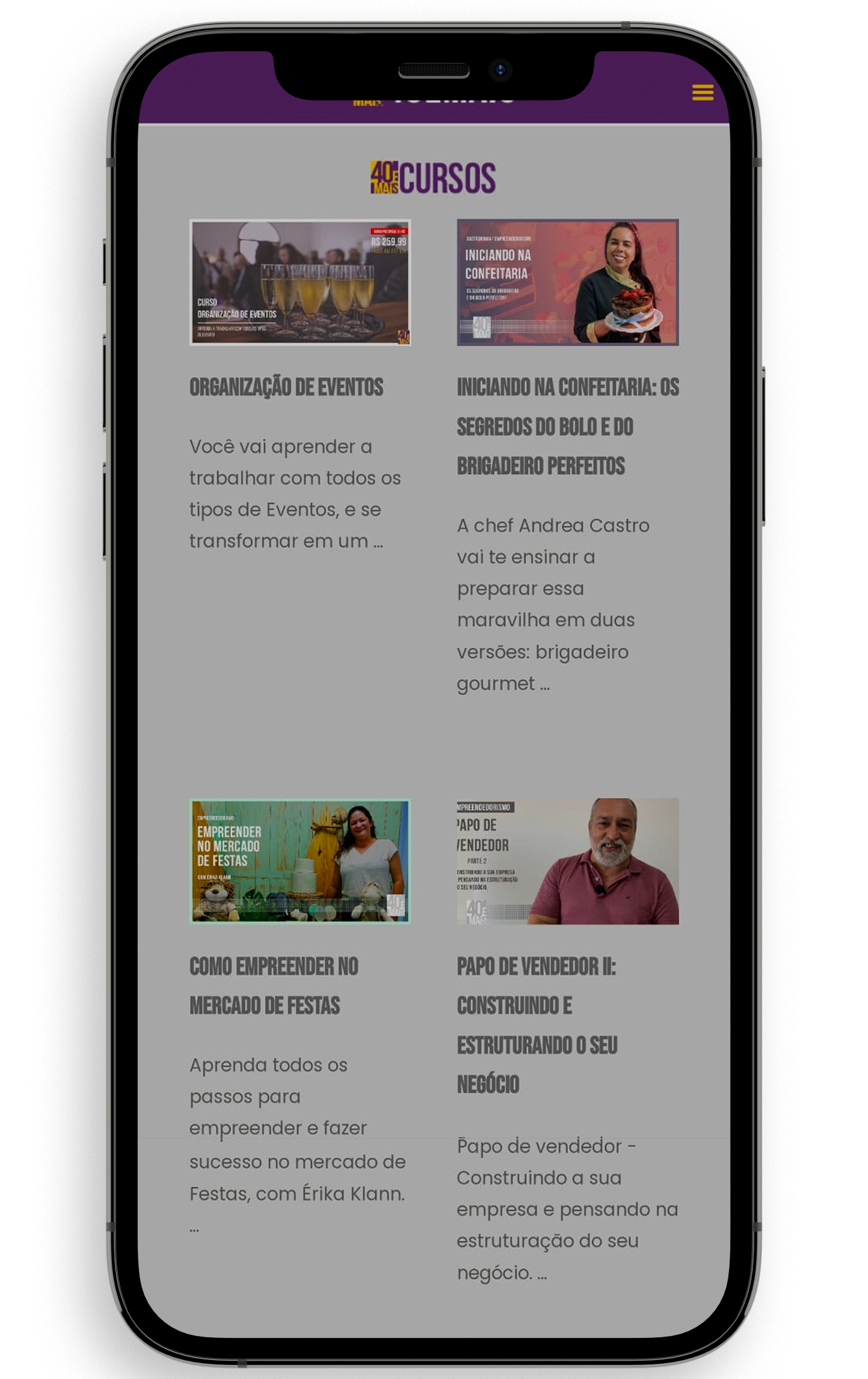
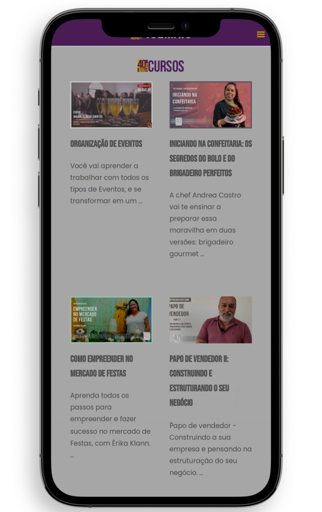
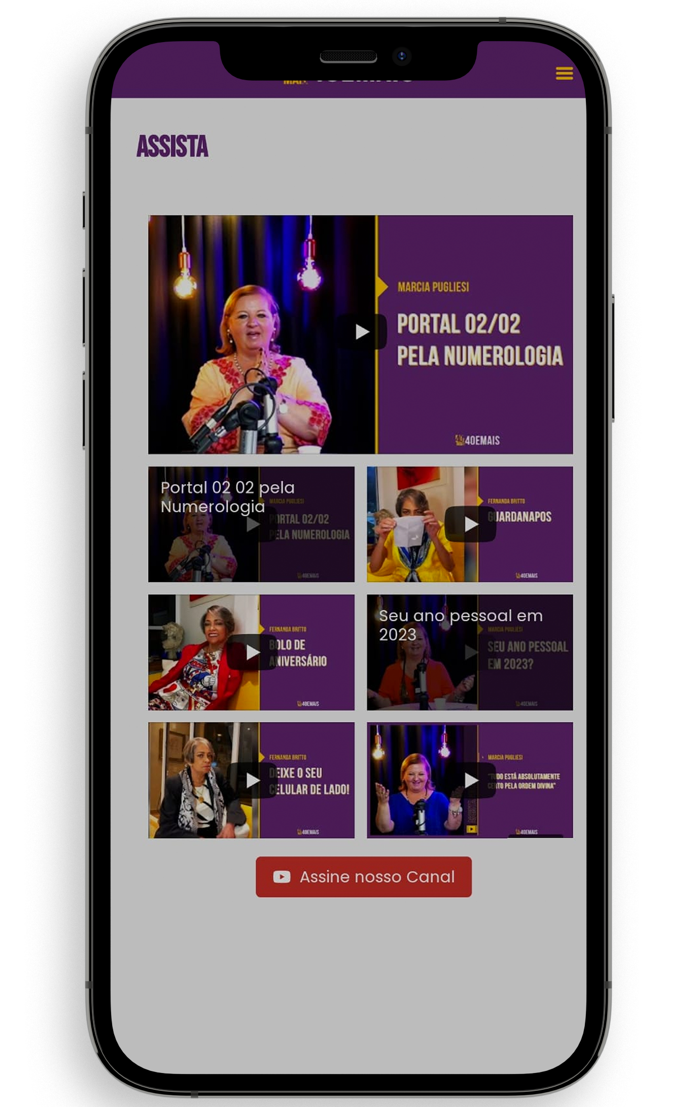
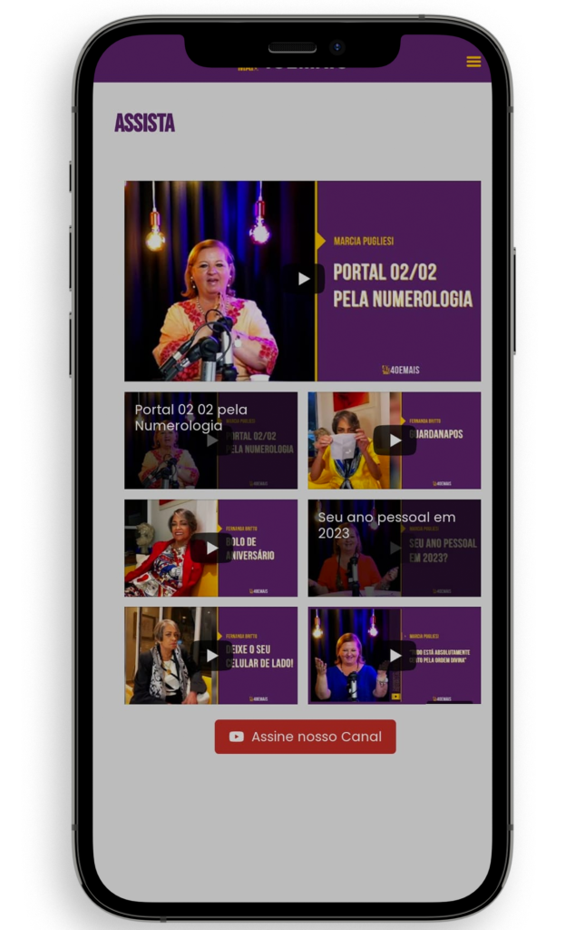
Digital magazine, events, content. A Complex Project.
D ESIGN
A beautiful and attention-grabbing design to help sell the project!
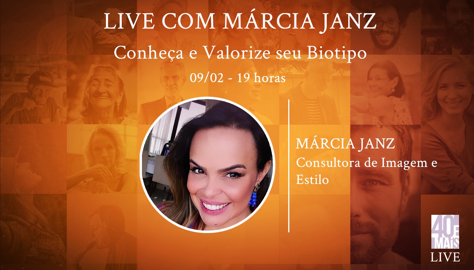
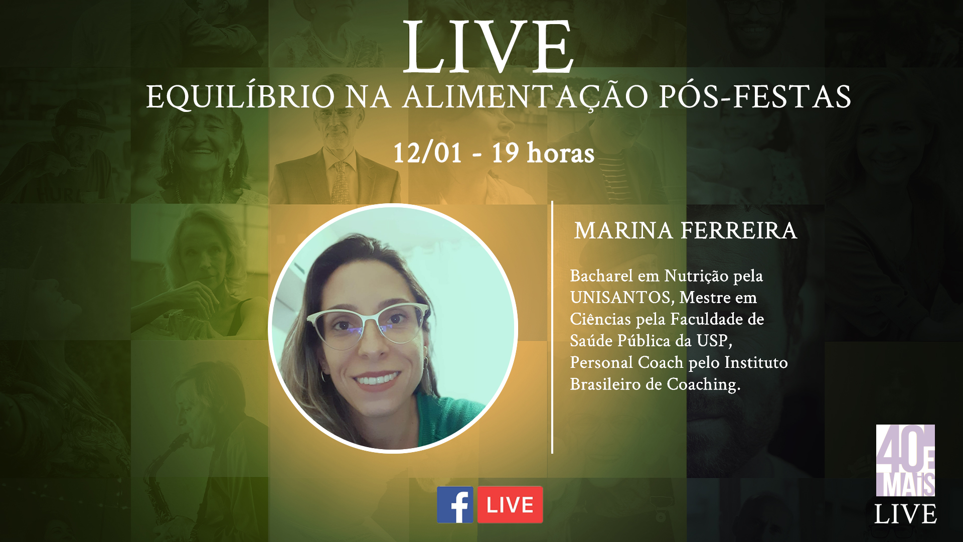
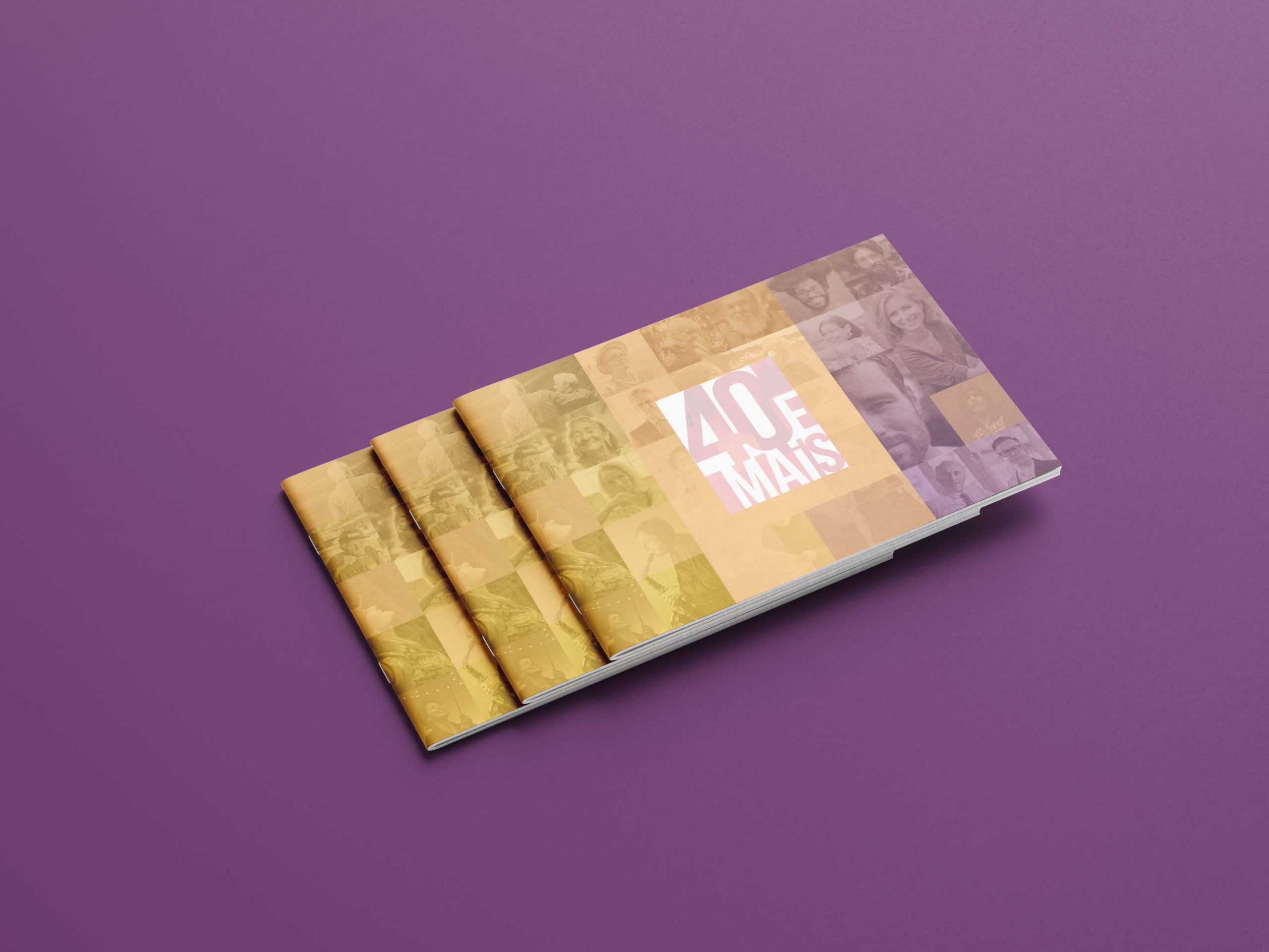
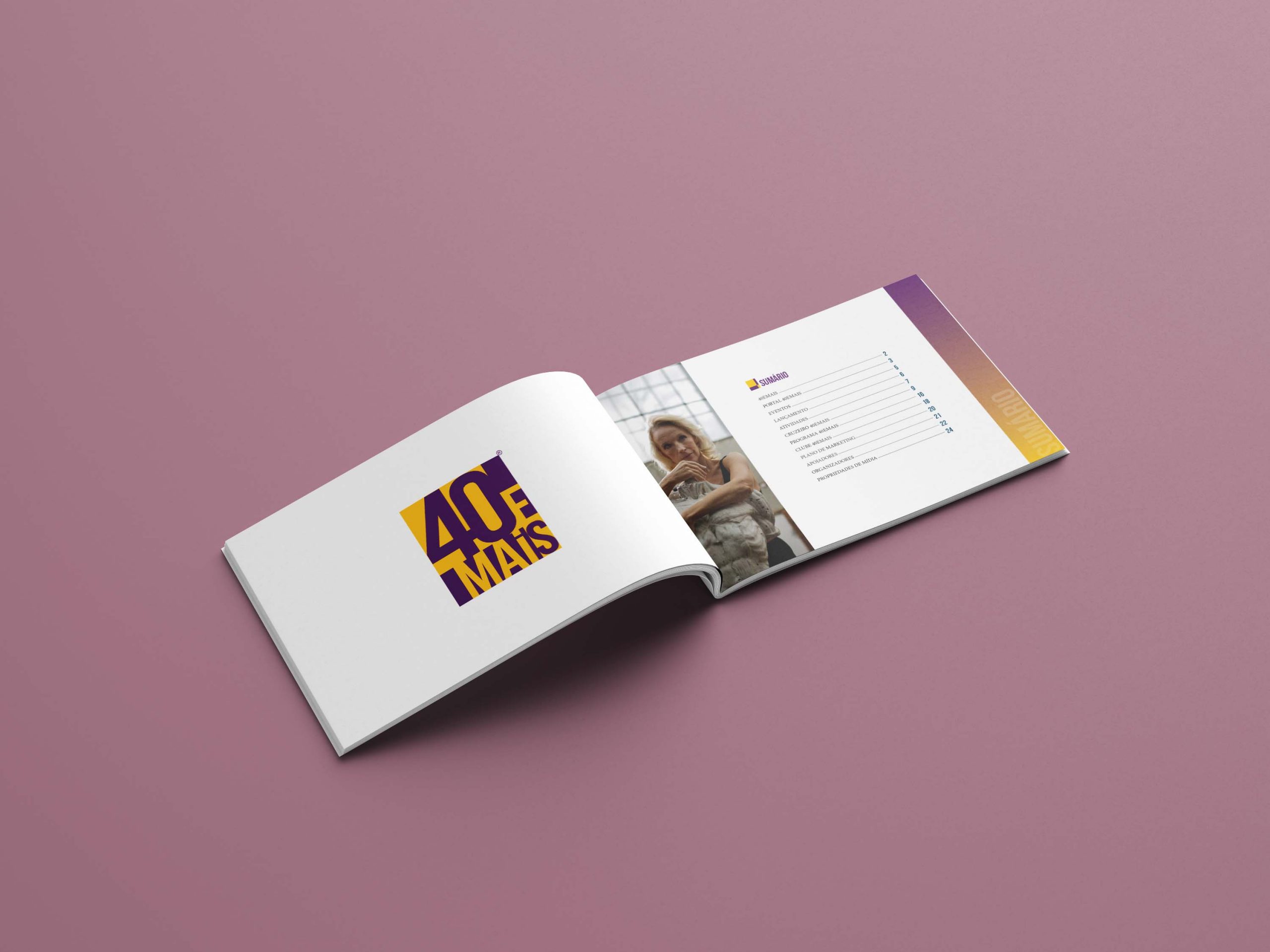
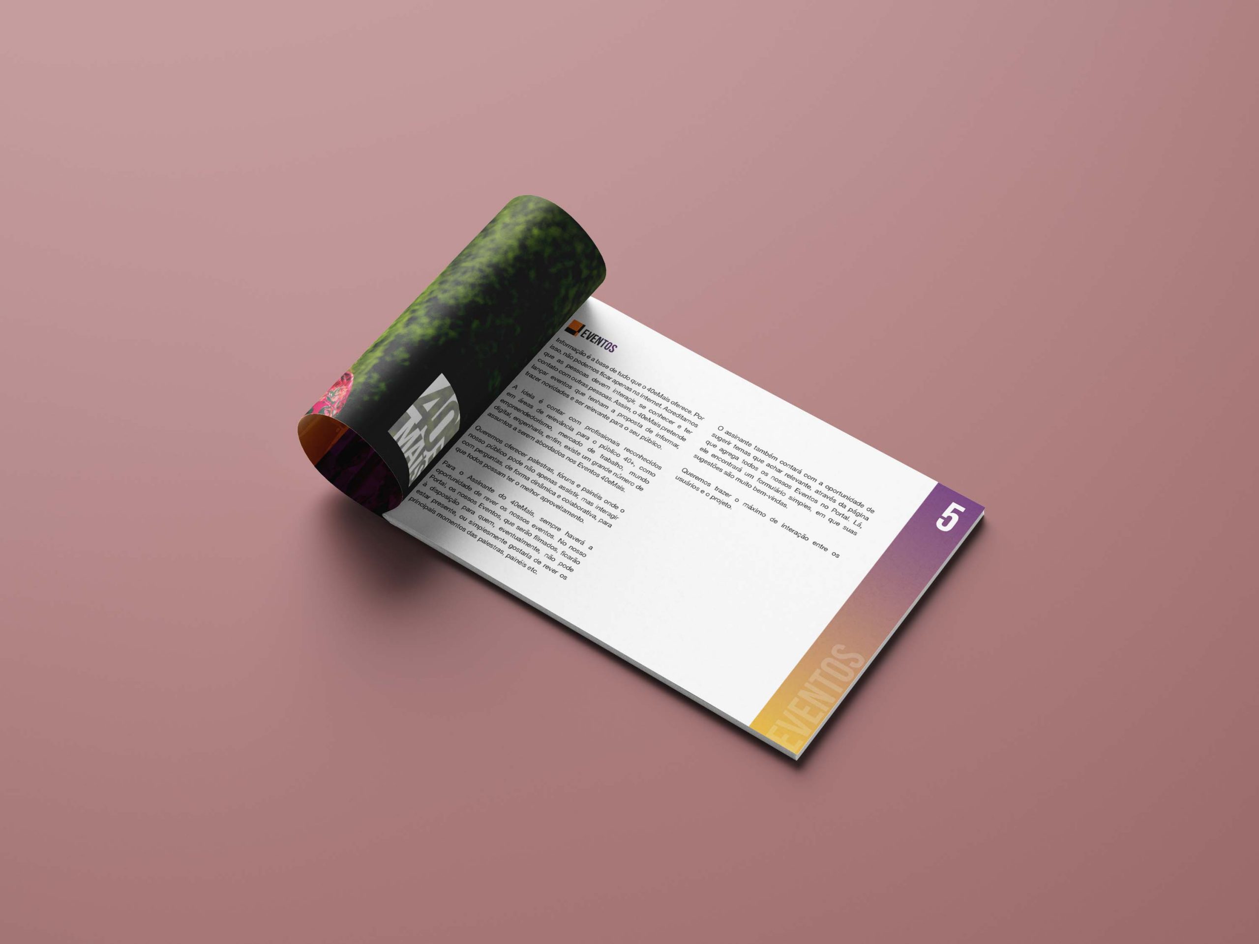
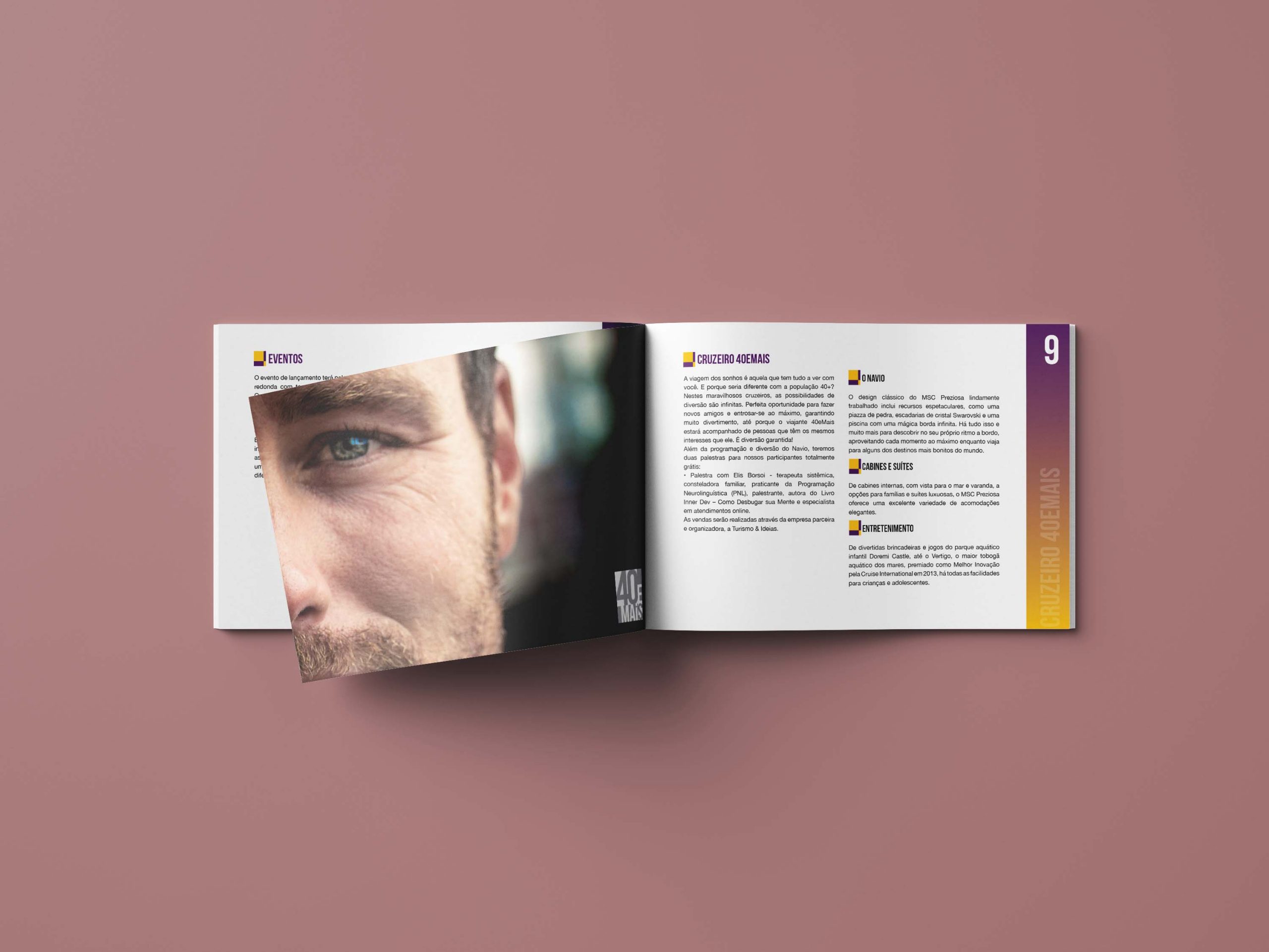
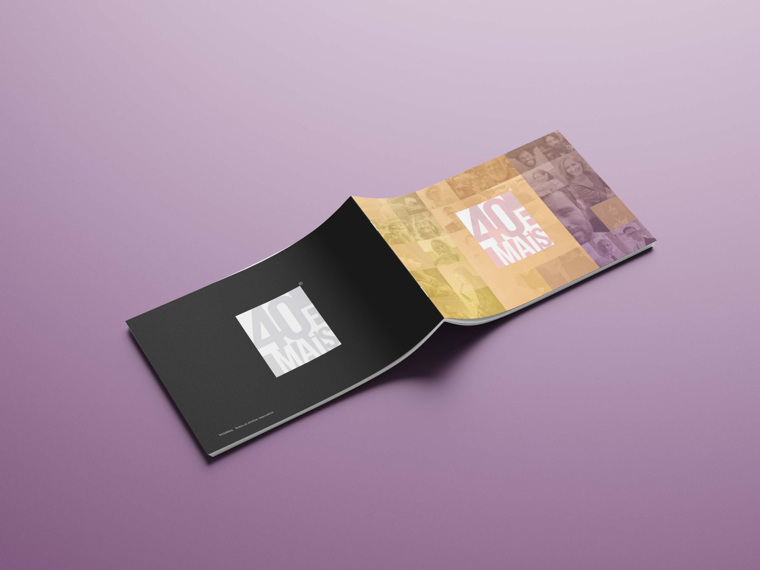
We also did the layout of the printed project so that the 40 and More team could send it to supporters, columnists, and potential sponsors. The project derives colors from the logo in the page details, features amazing photos, while presenting a light and highly readable layout.
MORE PROJECTS
■■■
![]()

